官方保障|直连原生正版模型,稳定、不降智、不掺水!所有 Pro 计划限时特惠!
立即开通
image2.vip
首页
灵感
教程
价格
API & Skills
返回灵感广场
1 / 1
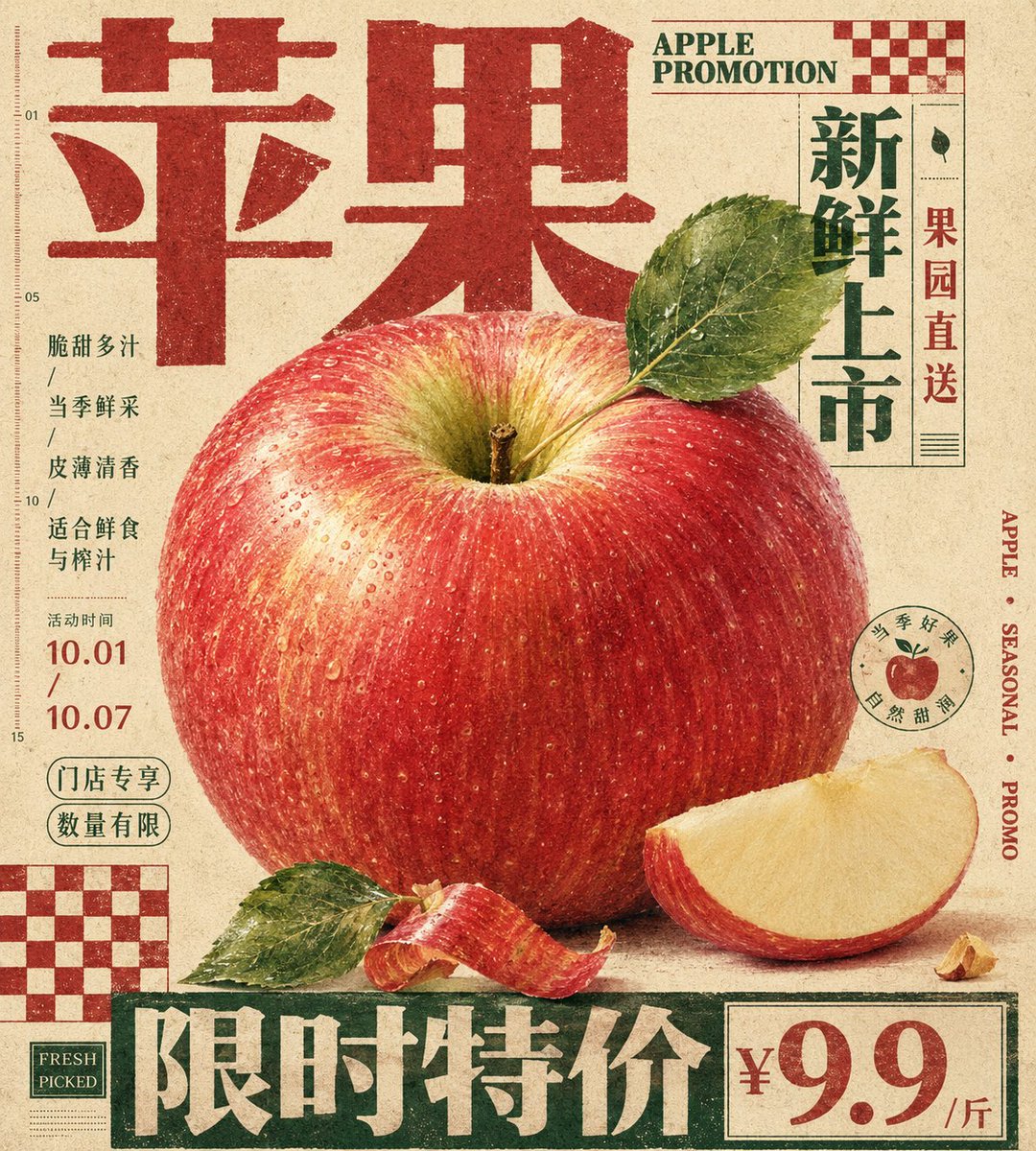
产品营销 - 复古触感印刷海报
案列来源:小小东
海报 & 营销
openai/gpt-image-2
#营销
#海报
#竖版 9:16
#复古胶片
#电商
复古风格杂志海报设计,结合触感纸张与艺术化布局。
7.4w
人正在用
4:5
推荐尺寸
1.2w
收藏人数
提示词模板
复制全文
Generate a vertical printed poster around specific theme content. First, translate the theme into an enlarged tactile main specimen or mass of matter, placed in the center or lower-middle of the frame, giving it clear recognizable edges, soft volume, local high-density details, and touchable material changes. The subject is not displayed in isolation but is sandwiched by a giant title, edge text, hard-edged checkerboard modules, and low-contrast explanatory text. The title uses a heavy font with a clear skeleton, becoming an edge structure at the top, bottom, or side, participating in the composition like a wall, base, or sidebar; text forms the structure before carrying semantics. Let the subject's outline, attached fragments, material edges, or symbolic shards partially overlap titles, vertical text, and geometric blocks, forming a clear but restrained foreground-background layer, so that imagery and layout interweave rather than avoid each other. The background is a single warm, low-noise, printable paper field with fine grain, fibers, particles, and a slight ink-absorption feel, used to unify the realistic subject, flat text, and geometric blocks. The background maintains a sense of breathing and medium, without creating real space. Colors are layered by responsibility: the paper base takes up the largest area; the subject retains the most delicate emotional colors, soft gradients, and local saturation; titles, edge characters, or checkerboards use flatter, more stable structural colors; body text and annotations recede into the paper with low contrast. The overall balance features clear area differences, brightness order, and a sweetness suppressed by the structure. Place one or two hard-edged checkerboard modules in corners as planar rhythm anchors; they have no perspective or shadow, printed directly on the paper to balance the subject's curves, title volume, and white space pressure. Small body text should not look like independent labels but be compressed into compact informational textures embedded in the gaps around the subject, maintaining short line spacing, restrained colors, and an editorial feel. Details of the subject are concentrated only in positions that best convey tactile sensation and theme identity, while other secondary edges are allowed to be cropped, blocked, or slightly softened to maintain hierarchy. The final surface has a vintage print passivation, with slightly soft text edges, ink deposition in color blocks, and paper texture running through all layers without blurring subject details, overall presenting a hybrid of a carefully typographed editorial poster, packaging layout, and specimen description. Theme: {argument name="poster theme" default="Apple promotion poster"} Ratio: {argument name="aspect ratio" default="9:10"}
立即使用此灵感
相似灵感推荐
查看更多
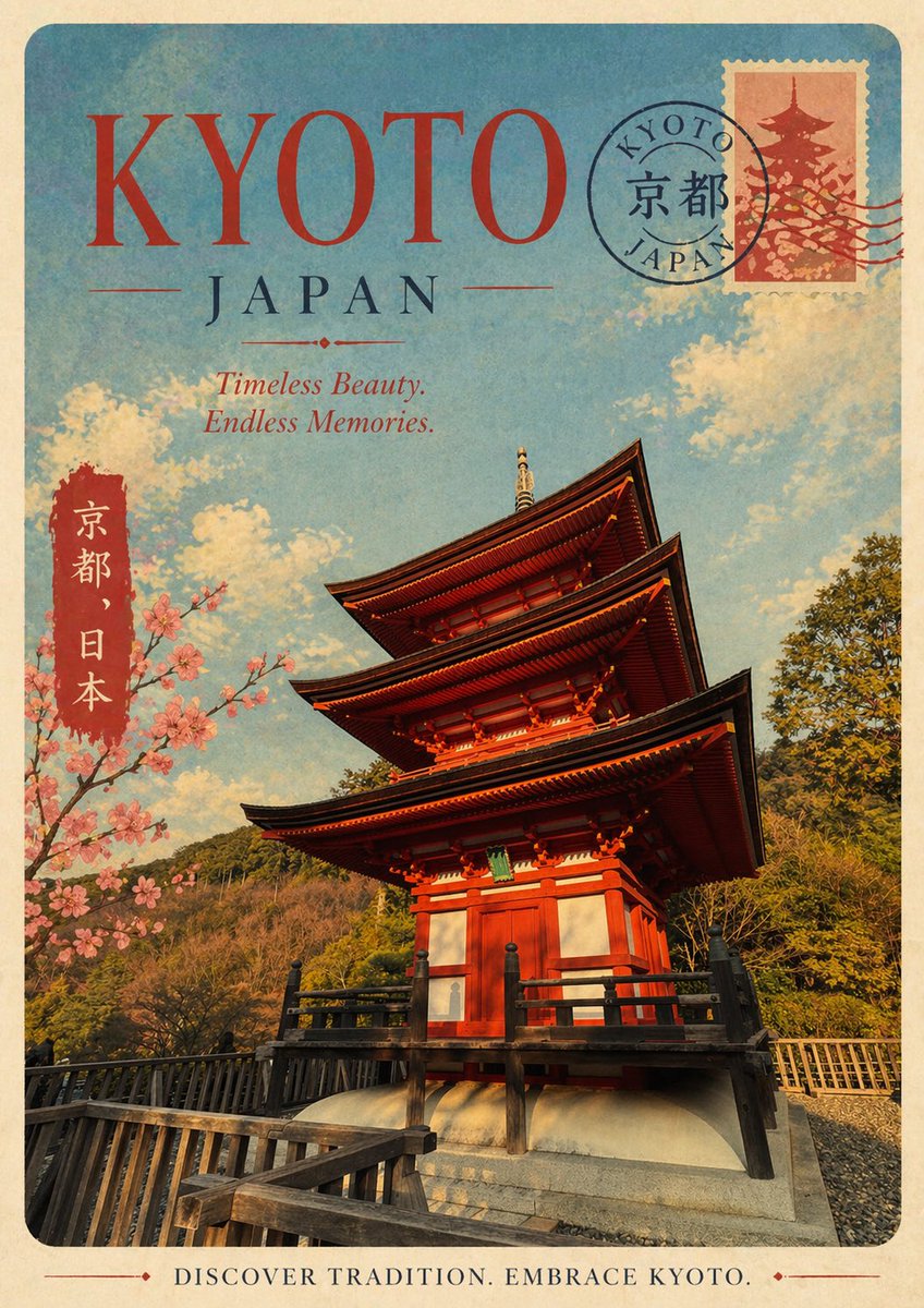
复古京都旅行海报
#营销
#日系
#海报
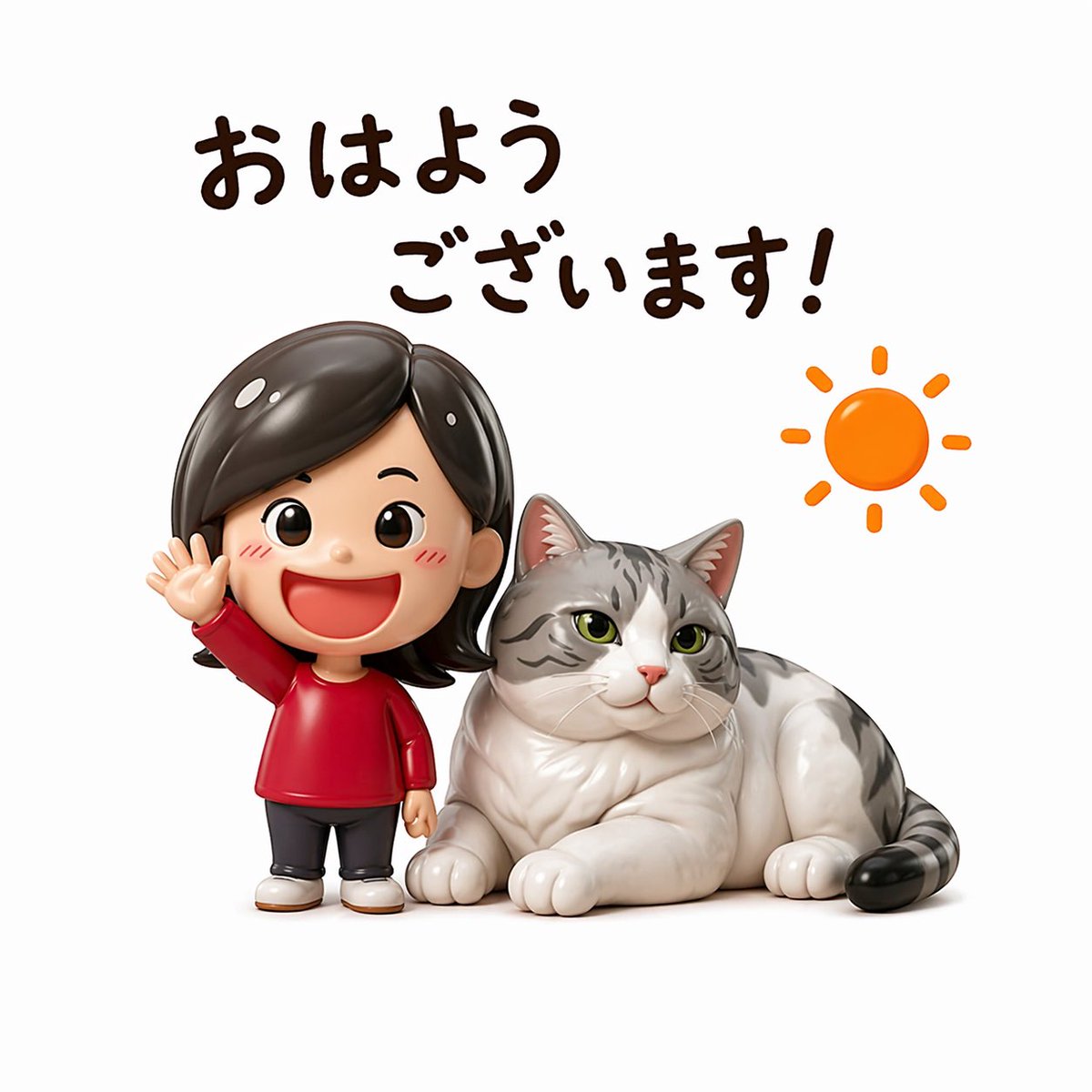
可爱早安问候人偶贴纸
#营销
#3D 渲染
#商务
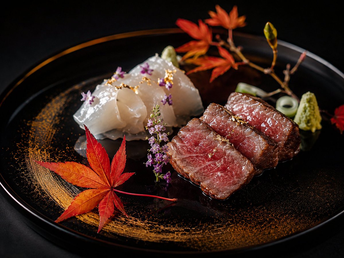
社交媒体帖子 - 豪华怀石和牛与刺身拼盘
#营销
#日系
#美食
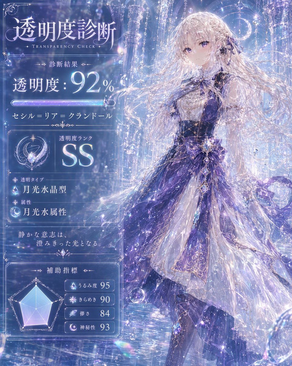
社交媒体帖子 - 月光透明检查卡
#营销
#日系
#信息图
漫画/故事板 - 水墨武士浪人海报
#营销
#日系
#海报
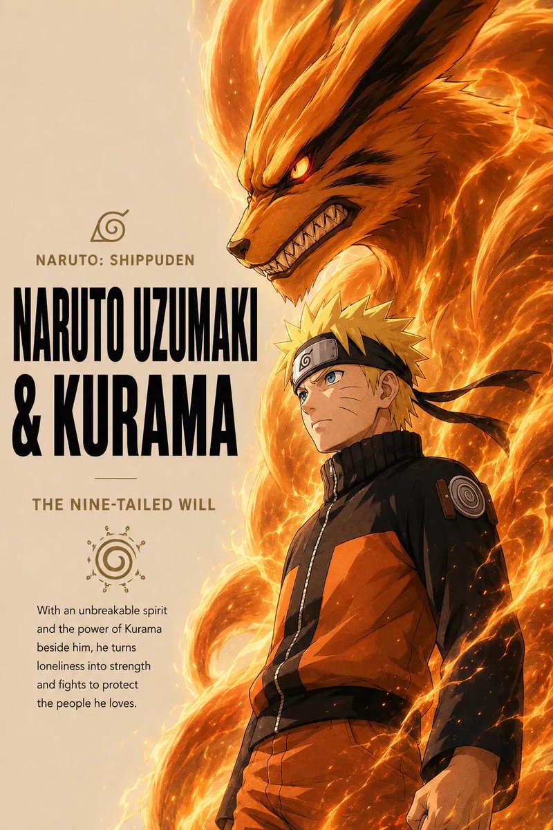
漫画/分镜 - 动漫战士精神海报
#营销
#海报
#竖版 9:16
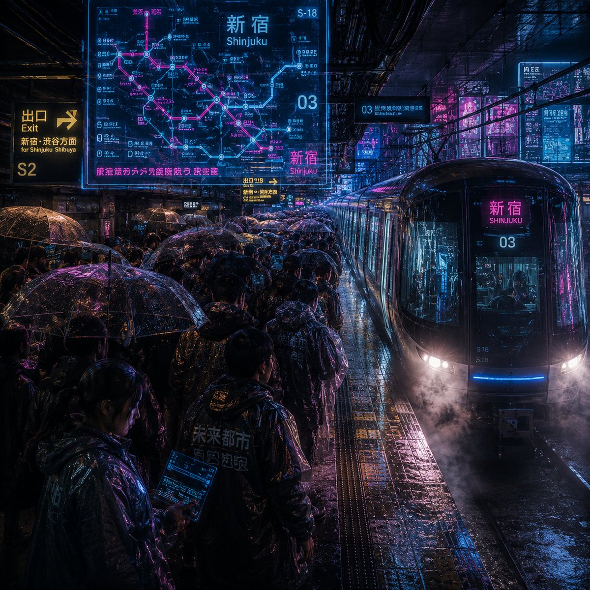
漫画/故事板 - 嘈杂的赛博朋克新宿雨月台
#营销
#日系
#竖版 9:16
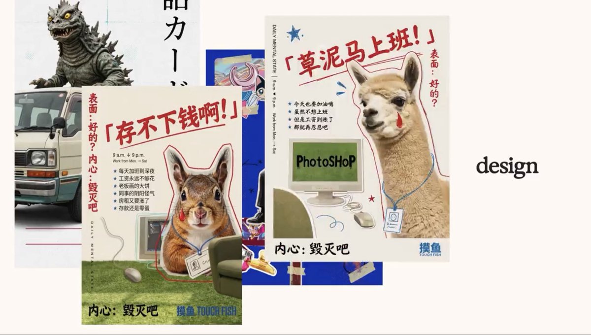
社交媒体帖子 - 复古迷因设计海报拼贴
#营销
#海报
#UI 设计
社交媒体帖子 - 水彩咖啡馆插画
#营销
#极简
#人像
漫画/故事板 - 复古杂志读者投稿页面
#营销
#日系
#海报